Posted: Tue Dec 22, 2009 7:40 pm
Better photograph, but different jersey.
The Largest Prep Hockey Message Board Community on the Web
https://www.ushsho.com/forums/

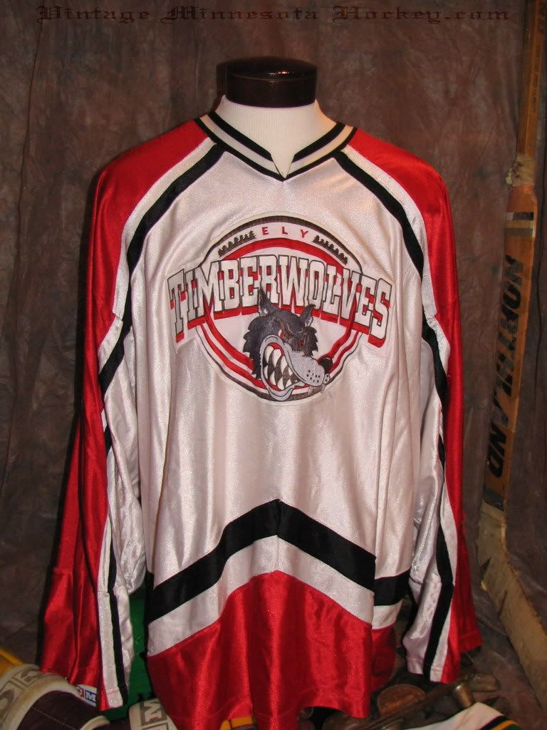
The new one is good but the other shows more teeth, seems tougher and is black..Teak wrote:This is the current Ely logo. I like the cartoonish style.
I don't know....hahaha....I am 9,000 miles from Ely (across the North Pole)!Goldfishdude wrote:The new one is good but the other shows more teeth, seems tougher and is black..
Were there oppositions to the old logo that it seemed too mean??


HAAAA!!! I think this is a legit hockey talker... I love this Bears jersey... and I agree with the "cartoon" logos.... So much could be done with Panthers, Jaguars, Wildcats, etc...Teak wrote:Another cool one is that of Traktor Chelyabinsk, a Russian league team. Polar bear snapping a hockey stick in two! This is the logo that White Bear Lake should use.
We had better be careful, Goldfishdude, or we're going to get kicked into The Cafe again!!
Yes, I like Warroad's also. Bright yellow and black look well together.Tavern wrote:I'd vote for Warroad's black uni's. Still have the classic warrior head logo and nothing beats black for an intimidating team like Warroad.
Yeah, the jerseys are probably hanging up a ways. But whoever hung them up should have seen that they were going to hang weird and weighted down the front so that the logos would be clearly seen. Attention to detail....NOT.Tavern wrote:It looks like the reason the photog didn't pull that first ely jersey tight is because he couldn't reach it. Isn't that a pic of the jersey hung in the X?
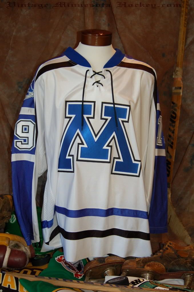
Any time you can incorporate the 3-color lettering it adds tremendously.. However, is that the Minnetonka logo?? I wasn't sure, because I thought the laces at the neck were diamond-tipped on the Tonka ones, plus, usually there is a money clip full of $50s and $100s near...Slap Shot wrote:People seem to be going the non-logo route, and some may call it plain but I think this one is super crisp with a nice contrast with the blue and white.
I think that is the jersey of the 2010 AA State champion, right?Goldfishdude wrote: Any time you can incorporate the 3-color lettering it adds tremendously.. However, is that the Minnetonka logo?? I wasn't sure, because I thought the laces at the neck were diamond-tipped on the Tonka ones, plus, usually there is a money clip full of $50s and $100s near...
Ouch! Kiss of death.Teak wrote:I think that is the jersey of the 2010 AA State champion, right?Goldfishdude wrote: Any time you can incorporate the 3-color lettering it adds tremendously.. However, is that the Minnetonka logo?? I wasn't sure, because I thought the laces at the neck were diamond-tipped on the Tonka ones, plus, usually there is a money clip full of $50s and $100s near...
Fishy Dude, as a former Osseo Oriole, and a current Bears fan, I must commend your good taste. I guess for me, it's all about the orange and black!Goldfishdude wrote:I was perusing thru the www.mnhockeyhub.com website looking at scores, and they do an awesome job having the HS team logos on the Team Pages and next to the scoreboard portion.
I have always taken a liking to my WBL Bears logo, as well as the Edina Hornets logo....
I absolutely love the Osseo Orioles hockey logo - similar to Goldy Gopher Hockey logo. As a general fan of sports, that is one logo I would wear just from a fan standpoint. I think the Chaska/Chanhassen logo is pretty cool. The plain M for Minnetonka or a picture of a Mustang don't do it for me.
Including/Excluding your own team's logo, I would be curious to get input on what others might think are some of the cool logos in HS hockey, one that you would wear, even though it's not necessarily the team you support.

agreedsteelheader wrote:Warroad by far.
Grand Rapids #2