I was perusing thru the www.mnhockeyhub.com website looking at scores, and they do an awesome job having the HS team logos on the Team Pages and next to the scoreboard portion.
I have always taken a liking to my WBL Bears logo, as well as the Edina Hornets logo....
I absolutely love the Osseo Orioles hockey logo - similar to Goldy Gopher Hockey logo. As a general fan of sports, that is one logo I would wear just from a fan standpoint. I think the Chaska/Chanhassen logo is pretty cool. The plain M for Minnetonka or a picture of a Mustang don't do it for me.
Including/Excluding your own team's logo, I would be curious to get input on what others might think are some of the cool logos in HS hockey, one that you would wear, even though it's not necessarily the team you support.
Which team logo is the coolest??
Moderators: Mitch Hawker, east hockey, karl(east)
-
PowerForward25
- Posts: 108
- Joined: Mon Nov 23, 2009 1:19 pm
-
GordonBombay
- Posts: 28
- Joined: Sun Dec 06, 2009 7:00 pm
Do they still wear those? Haven't been to one of their games this year and can't seem to remember what they wore for the Hill FSN game.PowerForward25 wrote:I love the Burnsville B logo. I don't know why but i have always liked it. Hastings has some nice jersey's this year as well. I know this is unrelated but i HATE WBL's bright orange breezer covers. Those have got to go.
-
chester1991
- Posts: 182
- Joined: Tue Feb 26, 2008 9:41 pm
-
Goldfishdude
- Posts: 1596
- Joined: Fri Jan 30, 2009 4:41 pm
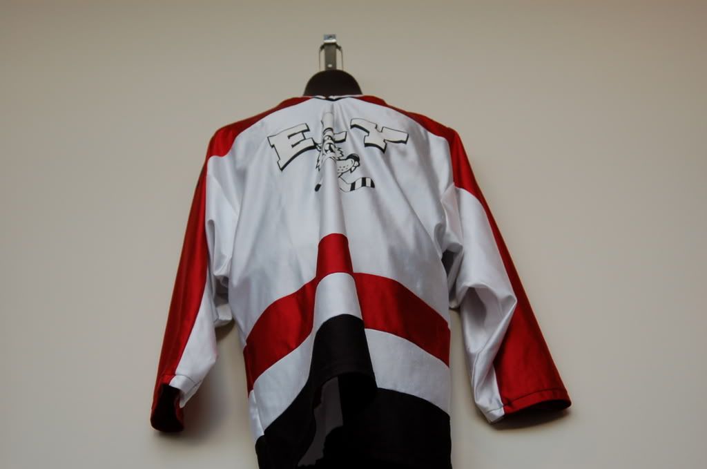
That was the other one I liked, although, because it's just White and Red (couldn't tell if any black, too) a little bland, but cool nonetheless.chester1991 wrote:I think North St Paul with a Polar bear with skates and a stick. Did North St Paul get that jersey first or the Pittsburgh Penguins? Best jersey in high school hockey.
I think, as with Roseville Raiders changing its logo to a cat/rat version, there was probably scrutiny about the persona the Pirate logo was representing.. yeah, yeah, it's a joke people get offended.
Yes the Burnsville B is nice, too...
In terms of WBL and it's orange shells, there are many kids who don't like them.... Stick w/ the black...
Re: Which team logo is the coolest??
I personally don't like the "postcard" look. Logos and jerseys that are too complicated don't do it for me. Keep it simple. Moorhead's "M" and Alexandria's A ...orange on black and red on black always are sharp. The East Grand Forks "E" is tasteful. When Fergus Falls uses a plain "FF" especially in a gold jersy I like that....I don't like how Fergus and Little Falls have whent away from their second color...gold. Fergus now has just maroon and white and now LF just has purple and white.Goldfishdude wrote:I was perusing thru the www.mnhockeyhub.com website looking at scores, and they do an awesome job having the HS team logos on the Team Pages and next to the scoreboard portion.
I have always taken a liking to my WBL Bears logo, as well as the Edina Hornets logo....
I absolutely love the Osseo Orioles hockey logo - similar to Goldy Gopher Hockey logo. As a general fan of sports, that is one logo I would wear just from a fan standpoint. I think the Chaska/Chanhassen logo is pretty cool. The plain M for Minnetonka or a picture of a Mustang don't do it for me.
Including/Excluding your own team's logo, I would be curious to get input on what others might think are some of the cool logos in HS hockey, one that you would wear, even though it's not necessarily the team you support.
-
mn miracle man
- Posts: 222
- Joined: Mon Dec 14, 2009 3:51 pm
-
PowerForward25
- Posts: 108
- Joined: Mon Nov 23, 2009 1:19 pm
I know they did last year. I don't know about this year though.GordonBombay wrote:Do they still wear those? Haven't been to one of their games this year and can't seem to remember what they wore for the Hill FSN game.PowerForward25 wrote:I love the Burnsville B logo. I don't know why but i have always liked it. Hastings has some nice jersey's this year as well. I know this is unrelated but i HATE WBL's bright orange breezer covers. Those have got to go.
Now don't take this personally but....
-
PoniesDad45
- Posts: 337
- Joined: Sun Jun 28, 2009 8:45 am
- Location: Woodbury

-
nhl_combine
- Posts: 42
- Joined: Fri Nov 20, 2009 3:58 pm
-
Goldfishdude
- Posts: 1596
- Joined: Fri Jan 30, 2009 4:41 pm
A couple of you guys have mentioned the color purple as to a detraction from logos..... I think there are just some colors that look better on uniforms... and purple is one that doesn't seem to have the best impact...
I also agree the color lettering on the H-M white jerseys looks awesome.....
I wished the St. Paul Saints would have actually stolen the Fighting Saints logo... They did take the S from that logo, tho...
I also agree the color lettering on the H-M white jerseys looks awesome.....
I wished the St. Paul Saints would have actually stolen the Fighting Saints logo... They did take the S from that logo, tho...
-
wblhockeyfan8
- Posts: 839
- Joined: Thu Feb 19, 2009 10:37 pm
- Location: White Bear Lake, MN. Front row of the student section.
-
eastside hockey
- Posts: 159
- Joined: Tue Nov 17, 2009 10:33 pm
- Location: Woodbury
-
MN hockey08
- Posts: 68
- Joined: Tue Jan 27, 2009 6:02 pm


-
Northsider
- Posts: 124
- Joined: Fri Jul 10, 2009 12:35 pm
- Location: Larpenteur Avenue